Mostrar mensagens com a etiqueta Artes. Mostrar todas as mensagens

sábado, 4 de fevereiro de 2012

L'Absinthe et la peinture française

L’Absinthe est une célèbre peinture d'Edgar Degas.
Les personnages représentés sont l'actrice Ellen Andrée et le peintre et graveur Marcellin Desboutin, tous deux également peints par Édouard Manet.

Ce tableau illustre à la fois le développement des cafés parisiens dans la deuxième moitié du XIXe siècle, en l'occurrence le café de la Nouvelle Athènes place Pigalle, alors lieu de réunion des Impressionnistes, mais aussi celui de l'alcoolisme qui ravage les couches populaires.

À l'origine intitulée Dans un café, cette toile fut présentée à la deuxième exposition des impressionnistes en 1876. C'est une peinture à l'huile sur toile de 92 x 68 cm peinte en 1876, conservée au Musée d'Orsay.
Absinthe, Nature morte

Du point de vue de la manière, Degas innove par son traitement atypique du cadrage dont la violente asymétrie souligne l'isolement des personnages Ellen Andrée et Marcellin Desboutin.

Ce type de recherches sur le cadrage furent très probablement influencées par le développement de la photographie à la même époque et se retrouve dans de nombreux tableaux de l'artiste: Le Champ de course (1876), Fin d'arabesque (pastel, 1876), tous deux conservés au Musée d'Orsay.

Degas opère donc une rupture dans le sujet et la manière, initiant une peinture inscrite dans la réalité et faisant fi des conventions artistiques et de la loi des genres (contrairement à Courbet quelques années auparavant).

Degas se rapprochera d'ailleurs du groupe impressionniste et participera à leurs expositions, mais sans jamais adopter leur manière.
Pablo Picasso lui rend hommage en 1901, au début de la période bleue, avec La Buveuse d'absinthe, huile sur toile du Musée de l'Ermitage à Saint-Pétersbourg.

RIC & Wikipedia

quinta-feira, 11 de outubro de 2007

«A Ronda da Noite» - Rembrandt van Rijn

Rembrandt Harmenszoon van Rijn
Leiden, 1606 - Amesterdão, 1669

Em 1638, Maria de Médicis, ex-rainha de França exilada na República das Províncias Unidas, é recebida em Amesterdão. O capitão Frans Banning Cocq, Senhor de Purmerlandt e do Ilpendam, e o tenente Willem van Ruytenburgh, Senhor de Vlaerdingen, pretendem fazer-se retratar na companhia da sua milícia de artilheiros, os Kloveniers – os arcabuzeiros. Eis o pretexto para Rembrandt Harmenszoon van Rijn criar mais uma obra-prima entre as muitas que entretanto atestam já o seu prestígio de excelente retratista.

Nos Países Baixos do século XVII, o retrato cívico é uma tradição já com dois séculos, mas o génio do pintor, ao invés de a desvirtuar, vai conferir-lhe aquele sopro de vida que caracteriza e distingue a sua pintura. Em vez da representação tradicional do grupo em filas paralelas ou sentado à mesa do banquete anual, é em plena acção que o grupo parece ser surpreendido, como se de um instantâneo se tratasse. Daí o nome indevido de A Ronda da Noite pelo qual desde logo se torna célebre, ainda que o seu exacto título seja A Companhia do Capitão Frans Banning Cocq e do Tenente Willem van Ruytenburgh. O excesso de verniz, que manteve a tela escurecida até 1947, contribuiu para reforçar a ideia errada de uma cena nocturna.

De Nachtwacht, 1642, Rijksmuseum Amsterdam

Apesar dos cortes laterais, superior e inferior que sofreu no século XVIII, o quadro a óleo sobre tela é ainda uma obra de grandes dimensões – 363 × 437 cm. A simetria do plano de fundo, onde se situa a porta pela qual a companhia vem saindo para o exterior, é ainda sustentada pela disposição algo simétrica dos dezasseis milicianos, embora o claro-escuro impossibilite a simetria perfeita. Ela é, porém, desfeita pela presença do capitão e do tenente à direita do centro, o que confere tensão ao quadro. O olhar é levado a deslocar-se um pouco para a esquerda, na direcção em que ambos caminham. E esta sensação de movimento comunica-se às restantes figuras que são captadas em diferentes momentos de acção: preparando-se para disparar, disparando e depois de disparar. A alternância de luz e sombra intensifica ainda mais a impressão de movimento, de acção, de vida, e a atenção prende-se às figuras mais importantes – o capitão e o tenente –, graças à intensa luz descendente que os destaca.

O carácter simbólico de alguns elementos desempenha um papel decisivo na identificação da companhia dos Kloveniers. A rapariga é uma espécie de mascote. Presa à cintura traz uma galinha, cujas unhas (klauwen, em Neerlandês) aludem ao nome da companhia, e na mão segura o corno das libações rituais. A pistola por trás da galinha representa o arcabuz. E o arcabuzeiro em frente da rapariga tem um capacete enfeitado de folhas de carvalho, um motivo tradicional da companhia. Um último pormenor subtil permite identificar a companhia como sendo de Amesterdão: na lapela da jaqueta do tenente vêem-se as três cruzes pertencentes às armas da cidade.

Os arcabuzeiros estão em movimento, falam uns com os outros e empunham as armas, e o capitão dá ordens ao tenente para a companhia marchar. É este dinamismo que torna A Ronda da Noite um quadro inovador e radicalmente diferente de todos os outros quadros de milícias cívicas. A mão do capitão e a arma do tenente, em primeiro plano, parecem sair da superfície da tela, graças à perícia pictórica de Rembrandt. Ambas contribuem para a cabal identificação das figuras: o gesto com a mão que dá a ordem inicial distingue o capitão, e a partazana simboliza o posto do tenente, na sequência de uma tradição medieval. O bordão que o capitão segura é também um elemento de identificação da patente, bem como as alabardas que os sargentos empunham.

As cores e as tonalidades, vibrantes e luminosas, além de distinguirem o plano anterior dos restantes, contribuem para realçar as figuras do capitão e do tenente, retratados com minúcia e apresentados com os ricos trajos que individualizam as suas patentes: o capitão, de negro e ostentando uma faixa vermelha, e o tenente, de amarelo dourado. Os planos posteriores, mais sombrios e pouco coloridos, criam um magistral efeito de contraste que, por si só, torna o quadro uma obra-prima.
Rembrandt encaminha-se para a maturidade absoluta precoce, que atinge antes de qualquer outro pintor de génio.

RIC

domingo, 30 de setembro de 2007

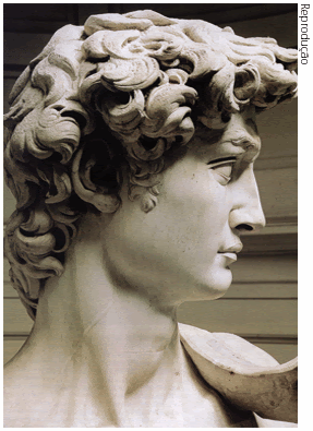
Michelangelo Buonarroti's David

Michelangelo di Lodovico Buonarroti Simoni (Caprese, March 6th, 1475 - Rome, February 18th, 1564) was an Italian Renaissance painter, sculptor, architect, poet and engineer. His versatility in the disciplines he took up was of such a high order that he is often considered a contender for the title of the archetypal Renaissance man.

His David, sculpted from 1501 to 1504, is one of Michelangelo's two greatest works of sculpture, along with the Pietà.
It is the David alone that almost certainly holds the title of the most recognizable statue in the history of art. It has become regarded as a symbol both of strength and youthful human beauty.

The 5.17 m (17 ft) marble statue portrays the Biblical King David at the moment that he decides to do battle with Goliath. It came to symbolise the Florentine Republic. This interpretation was also encouraged by the original setting of the sculpture outside the Palazzo della Signoria, the seat of civic government in Florence.
The completed sculpture was unveiled on September 8th, 1504.
To protect it from damage, the sculpture was moved in 1873 to the Accademia Gallery, and a replica was placed on the Piazza della Signoria in 1910.


Fundamental to Michelangelo's art is his love of male beauty, which attracted him both aesthetically and emotionally. In part, this was an expression of the Renaissance idealization of masculinity, but in Michelangelo's art there is clearly a sensual response to this aesthetic. Such feelings caused him great anguish, and he expressed the struggle between Platonic ideals and carnal desire in his sculpture, drawing and his poetry too, for Michelangelo was also a great lyric poet.
The sculptor's expressions of love have been characterized as both Neoplatonic and openly homoerotic; recent scholarship seeks an interpretation which respects both readings.
One example of the conundrum is the story of the sixteen year old Cecchino dei Bracci, whose death, only a year after their meeting in 1543, inspired the writing of forty eight funeral epigrams, which allude to a relationship that was not only romantic but physical as well:

La carne terra, e qui l'ossa mia, prive
de' lor begli occhi, e del leggiadro aspetto
fan fede a quel ch'i' fu grazia nel letto,
che abbracciava, e' n che l'anima vive.

The flesh now earth, and here my bones,
Bereft of handsome eyes, and jaunty air,
Still loyal are to him I joyed in bed,
Whom I embraced, in whom my soul lives.

The greatest written expression of his love was given to Tommaso dei Cavalieri, who was 23 years old when Michelangelo met him in 1532. Cavalieri was open to the older man's affection: "I swear to return your love. Never have I loved a man more than I love you, never have I wished for a friendship more than I wish for yours." Cavalieri remained devoted to Michelangelo till his death.
Michelangelo dedicated to him over three hundred sonnets and madrigals, constituting the largest sequence of poems composed by him. Their homoerotic nature was recognized in his own time, so that a decorous veil was drawn across them by his grandnephew, who published an edition of the poetry in 1623 – with the gender of pronouns changed…
John Addington Symonds, the early British homosexual activist, undid this change by translating the original sonnets into English and writing a two-volume biography, published in 1893.
The sonnets are the first large sequence of poems in any modern language addressed by one man to another, predating Shakespeare's sonnets to his young friend by a good fifty years.

Prudishness in the era of advertising?!

I feel as lit by fire a cold countenance
That burns me from afar and keeps itself ice-chill;
A strength I feel two shapely arms to fill
Which without motion moves every balance.

Through his poetry and visual art we may glimpse the arc of his imagination…

RIC & Wikipedia

Muito obrigado, Paulo, pela tua estimulante sugestão!

Mais um Setembro que termina.
A uns, «olá, bem-vindos»
A outros, «adeus, até um dia»
Que o mundo não tem como parar…

domingo, 26 de agosto de 2007

Regalo para os olhos e a fantasia...

O prometido é devido, e neste caso é bem verdade que o prazer é todo meu e a honra também!
Mostro, hoje e aqui, a arte pictórica de um amigo bloguista que, pelo que pude verificar, é mais conhecido – e mais premiado também – como cartoonista, mas a sua pintura, a meu ver, ombreia facilmente com a de nomes nacionais consagrados. Nicknames à parte, apresento António Ferreira dos Santos.


Ascensão

Barroco

Devaneio

Outono 2

Paisagem

Vitral

Muito obrigado, António, por esta oportunidade e pela tua arte!

Para um contacto in loco com o pintor e o cartoonista, aqui fica o elo para o seu blogue «Cartoonices – Retalhos da arte de um cartoonista». Vão lá ver e deliciem-se!

Dedico este édito – para mim, muito especial – à memória já saudosa do professor, intelectual, escritor e figura cimeira da cultura portuguesa, Eduardo Prado Coelho.

RIC

segunda-feira, 16 de julho de 2007

The Art of Steve Walker


«As a homosexual I have been moved, educated, and inspired by works that deal with a heterosexual context. Why would I assume that a heterosexual would be incapable of appreciating work that speaks to common themes in life, as seen through my eyes as a gay man? If the heterosexual population is unable to do this, then the loss is theirs, not mine.»


The focus of his paintings often depicts sadness and loneliness to reflect the reality that much of anyone's life is sad and lonely.


«Any minority wants and needs to find artistic voices that reflect their own personal situations, and, in doing so, validate and record their lives and cultures for themselves and for the larger world.»


«My art is about love, hate, pain, joy, touch, communication, beauty, loneliness, attraction, hope, despair, life and death.»


In recent years Steve Walker's work has been exhibited in galleries in Toronto, Montreal, New York, Philadelphia and Key West.
In 2002 his work was exhibited at the First International Salon of Contemporary Artists, in Lisbon, Portugal.

Steve Walker
RIC

quinta-feira, 12 de julho de 2007

II. «Strani Amori»


Mi dispiace devo andare via
Ma sapevo che era una bugia
Quanto tempo perso dietro a lui
Che promette poi non cambia mai
Strani amori mettono nei guai
Ma in realtà siamo noi

E lo aspetti ad un telefono
Litigando che sia libero
Con il cuore nello stomaco
Un gomitolo nell'angolo
Lì da solo dentro un brivido
Ma perché lui non c'è, e sono

Strani amori che fanno crescere
E sorridere tra le lacrime
Quante pagine, lì da scrivere
Sogni e lividi da dividere

Sono amori che spesso a questa età
Si confondono dentro a quest'anima
Che s'interroga senza decidere
Se è un amore che fa per noi

E quante notti perse a piangere
Rileggendo quelle lettere
Che non riesci più a buttare via
Dal labirinto della nostalgia
Grandi amori che finiscono
Ma perché restano, nel cuore

Strani amori che vanno e vengono
Nei pensieri che li nascondono
Storie vere che ci appartengono
Ma si lasciano come noi

Strani amori fragili,
Prigionieri liberi
Strani amori mettono nei guai
Ma in realtà siamo noi

Strani amori fragili,
Prigionieri liberi
Strani amori che non sanno vivere
E si perdono dentro noi

Mi dispiace devo andare via
Questa volta l'ho promesso a me
Perché ho voglia di un amore vero
Senza te.

Renato Russo / Renato Manfredini Júnior:
N. Rio de Janeiro, a 27 de Março de 1960
† Rio de Janeiro, a 11 de Outubro de 1996
Cantor, compositor e músico da banda "Legião Urbana".

Lamento, devo ir-me embora
Mas sabia que era uma mentira
Quanto tempo perdido atrás dele
Que promete mas depois nunca muda
Estranhos amores metem-se em apuros
Mas na realidade somos nós.

E esperas por ele ao telefone
Lutando para que esteja livre
Com o coração no estômago
Um sentido enrolado
Ali sozinho, por dentro um arrepio
Mas porque é que ele não está, e são

Estranhos amores que fazem crescer
E sorrir entre as lágrimas
Quantas páginas, ali a escrever
Sonhos e marcas a dividir.

São amores frequentes nesta idade
Confundem-se dentro desta alma
Que se interroga sem decidir
Se é um amor que se faz por nós

E quantas noites perdidas a chorar
Relendo aquelas cartas
Que já não consegues deitar fora
Do labirinto das saudades
Grandes amores que terminam
Mas porque é que ficam, no coração

Estranhos amores que vão e vêm
Nos pensamentos que os escondem
Histórias verdadeiras que nos pertencem
Mas que se deixam como nós

Estranhos amores frágeis
Prisioneiros livres
Estranhos amores metem-se em apuros
Mas na realidade somos nós

Estranhos amores frágeis
Prisioneiros livres
Estranhos amores que não sabem viver
E se perdem dentro de nós

Lamento, devo ir-me embora
Desta vez prometi-o a mim mesmo
Porque quero um amor de verdade,
Sem ti.

Tradução revista por RIC

sábado, 23 de junho de 2007

II. documenta 12: Kassel, Hessen, Deutschland.

The documenta is one of the world's most important exhibitions of contemporary art which takes place every five years in Kassel, Germany.
It was founded by artist, teacher and curator Arnold Bode in 1955 as part of the Bundesgartenschau (Federal Horticultural Show) which took place in Kassel at that time. This first documenta was – in contrast to most expectations – a considerable success as it featured most of the artists which are generally considered to have had a significant influence on modern art, e.g. Picasso or Kandinsky.
The more recent documentas feature art from all continents; nonetheless most of it is site-specific.
The documenta is perceived to be one of the world's most important art exhibitions, only comparable to the "Biennale di Venezia".

Can the masses appreciate modern art? The documenta art extravaganza in Kassel is betting they can.
For the first time ever, organizers are doing everything they can to help locals to understand the art – and art-lovers to understand the locals.

Can art be explained? documenta thinks it can.

■ A ship made out of gas canisters.
■ Rows of wooden chairs.
■ Three orange computer screens.
■ Self-strumming guitars.

What do these things mean?
And why are they all housed in a giant, corrugated-plastic shack?

Many contemporary art exhibitions are perplexing.
And this year's documenta, which runs from June 16.th to September 23.rd, doesn't break the mould. Except for one major exception: unlike the others that have preceded it, documenta 12 has a deliberate educational component.
The event is determined to allow non-experts entry into the hermetic realm of contemporary art.
Through educational programming, guided tours, community outreach programs, three magazines, and, they claim, the art itself, organizers of this year's documenta aim to enlighten rather than confuse.
"Education at this documenta is not a service or tool," Ruth Noack, documenta 12's curator, told Spiegel Online. "It is, instead, an integral part of the exhibition."
This is a radical move for documenta, which has often been seen by Kasselers in its 52-year history as an elitist ship that docks in the city every five years for 100 days and then departs – leaving little in its wake aside from millions in city-wide income.

The next 100 days, though, are supposed to be different.
In order to achieve its educational, egalitarian ends, documenta 12 has enlisted the help of a multitude of tour guides (or "mediators") – an idea from the show's artistic director, Roger M. Buergel, Noack's moustachioed, articulate husband. And they're not solely in the form of starving German college students. High school students will be a part of it, as will younger children. Additionally, people from across the globe, including from South Africa and Australia, will take part thanks to help from the Goethe Institute.


First impressions about documenta 12
(German & English)

"For me it's been a great experience," says Till Maciejewski, an athletic-built 10.th-grader who has been working on his tour since October. "It's more about discussions with people than about art questions," he says, "and I get to talk about the art that I think is interesting, like Juan Davila," a Chilean artist whose work from the 1970s features pornography, bestiality, and other social taboos. "Because my aunt and uncle are also artists, there's family pride to be helping out at documenta."

Indeed. documenta, at a total cost of €19 million, includes over 500 works of art by 113 artists and occupies five buildings, one of which, the Aue-Pavillion, was constructed solely for the exhibit over a sprawling 10,000 square meters/107,640 square feet. As students became increasingly involved in tackling this behemoth, their status in school – and self-confidence – changed, too.

"The notion that art can never entirely be explained," documenta's artistic director writes, "is exactly where art's power lies." It's a powerful sentiment, and the educators and activists involved are anxious to see what occurs in the next 100 days, to see if art's power can truly conquer modernity's load-bearing walls of economic, cultural, and social segregation.
After those 100 days, however, who knows?
Asked if she thought documenta's efforts at inclusion, outreach, and education would succeed in future renditions of the show, civic leader Güleç leaned forward and smirked, "What do you think?"


I've spent one of the most wonderful months of my life in this medium-sized German town.
One of its main attractions is an 18.th century palace/castle called "Wilhelmshöhe" and its surrounding beautiful park, where for the first time ever documenta 12 will also be housed.
Besides other promotional videos (cf. YouTube, of course), I think you'd like to take a look at the exhibition's official website (German & English) – just click
here.

Enjoy!

RIC

sexta-feira, 26 de janeiro de 2007

Dianne Reeves, «Strings Attached»


25 de Janeiro de 2007
21:00
Grande Auditório
Duração: 1:30 (sem intervalo)

«Dianne Reeves é hoje considerada uma das mais directas sucessoras das grandes vozes femininas do jazz: Sarah Vaughan, Billie Holliday ou Dinah Washington.
A cantora norte-americana iniciou a sua carreira no final dos anos setenta, mas foi na década de oitenta que viu reconhecido o seu virtuosismo, tornando-se a primeira vocalista a assinar contrato com a editora Blue Note/EMI.
"Good Night, and Good Luck", a banda sonora original do filme homónimo (2005) realizado por George Clooney, relançou a carreira da diva do jazz, logo após ter recebido o Grammy para Melhor Interpretação de Jazz.
O sucesso de vendas e o novo disco que a cantora gravou com o duo que a acompanha esta noite em palco justificam o seu regresso a Portugal.»

Eh pá! O espectáculo foi o máximo! E um dos vários bis foi… "Misty"!… É preciso dizer mais alguma coisa?

Dianne Reeves is today considered one of the immediate successors of great feminine voices of jazz as Sarah Vaughan, Billie Holliday or Dinah Washington. The North‑American singer initiated her career by the end of the 70s, but it was in the 80s that she saw her virtuosity recognized, becoming the first vocalist to sign a contract with Blue Note/EMI publishing company.
"Good Night, and Good Luck", the original soundtrack of the homonymous film (2005) directed by George Clooney, relaunched the jazz diva's career, soon after she received the Grammy for Best Jazz Interpretation.
The selling success and the new album the singer has recorded with the duo that accompanies her on stage tonight justify her coming back to Portugal.

Oh man! The show was great! And one of the several encores was… "Misty"…! Do I need say more?

RIC

terça-feira, 12 de dezembro de 2006

The Portuguese in Japan in 1543…

"Nanban" (南蛮 "southern barbarian") is a Japanese word which originally designated people from South Asia and South-East Asia. It followed a Chinese usage in which surrounding "barbarian" people in the four directions had each their own designation.

In Japan, the word took on a new meaning when it came to designate Europeans, the first of who started to arrive in Japan in 1543, first at Tanegashima from Portugal, then Spain, and later the Netherlands, although the Dutch were more commonly known as "kōmō" ("red-haired"), and England. The near-total exclusion of Europeans from the archipelago occurred in 1650, when the "Sakoku" Seclusion Laws were promulgated.

The word "Nanban" was thought naturally appropriate for the new visitors, since they came in by ship from the South, and their manners were considered quite unsophisticated by the Japanese.


"Folding screen depicting the arrival in Japan of Nanban"
(Gold on paper, a pair of six panel folding screens)

"Many folding screens on the theme of the manners and customs of the Portuguese who came to Japan by ship were produced from the Momoyama period through to the Edo era. Today such screens are generally called "Nanban screens" (in Portuguese, "biombos Nanban").

The production of approximately 70 screens has been confirmed to date, and they are generally classified into one of three categories. The first category, which accounts for approximately half their number, depicts in the left-hand screen a scene of a Nanban ship anchored at port with goods being unloaded from the ship, while depicted in the right-hand screen are a Christian church and Christian priests, opposite which there is a procession made up of the ship's captain (who also served as the governor of Macao) and others as well as Japanese onlookers who are watching these people with curiosity. In the second category, the scenes depicted in both screens belonging to this first category are contained in the right-hand screen, while the left-hand screen depicts a foreign port from which Nanban ships are departing. In the third category, scenes depicted in the second category are depicted in the right-hand screen, while the left-hand screen is composed of a scene depicting a building in a foreign country with Nanban people on a terrace.

The screen held in the museum's collection belongs to the first category, although its depiction of two Nanban ships arriving in port is extremely rare. Although the artist who painted this screen also remains unknown, judging from elements such as the stability of composition, sophisticated brushwork and high quality paints, it is thought that it was painted by a highly accomplished painter who had considerable training in Chinese painting. Recently, it has also been suggested that it was painted by Togaku, a disciple of Hasegawa Tohaku.


One point of interest when viewing Nanban screens is the glimpses it affords of the understanding that the Japanese at that time had of the West. The image of Westerners with their tall stature and large noses has carried through to the present day. The previously mentioned terms of "foreign ports" and "foreign buildings" in place of the use of "West" and "Western" is probably due to the inclusion of Chinese elements in the portrayal of Nanban manners and customs and architecture. It is interesting to note that the reason why the Nanban screens mentioned above became popular is thought to be because they were regarded as symbols that brought good fortune (engimono).

Even after Japan's period of isolation had put an end to Nanban trade, while the production of Nanban screens did decrease the fact that they did not disappear altogether is most probably attributable to the perception that they were good luck symbols and not because of any relation between their subject matter and Christianity."

Jun'ichi Okubo
National Museum of Japanese History

The Portuguese Museum of Ancient Arts – Museu Nacional de Arte Antiga, Lisboa – owns two of these Nanban folding screens in its wonderful, vast collection.

segunda-feira, 6 de novembro de 2006

Art & Political Commitment


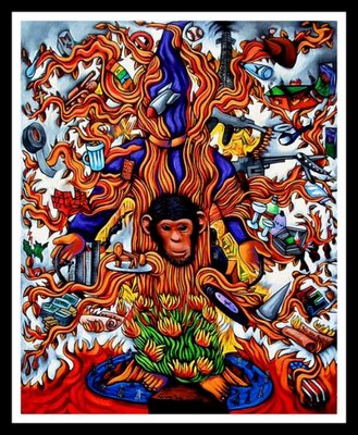
El Árbol de Muerte de Bush
Bush's Tree of Death
(Acrylic on canvas. 24"×30"/60cm ×76cm)

Tony de Carlo's own words on his work:

"The centerpiece – the Tree itself – is based on and intertwined with the most infamous photograph the Bush regime has given the world: the "State of Liberty" photograph of the prisoner from the Abu Ghraib prison in Iraq.
There were a lot of things Dubya gave the USA that I simply could not figure a way to simply portray. The lost jobs, the millions without health insurance, the attack on a woman's right to choose, the hypocrisy, all of the children left behind, the fear mongering, the lobbyists, the Saudis, his DUI (driving under the influence) convictions, his secrecy, his creepy cabinet, his Stepford wife and her manslaughter conviction, his AWOL (Absent Without Official Leave), his stuttering clumsiness and misspeaks, his record deficits, his pandering to the lowest common denominator, his "just keep shopping" advice to Americans during war, his total failure at diplomacy which led to war, the world's resentment of us, his hillbilly dirt ranch and his ugly ass parents.
I can only wonder how many more symbols of death and destruction Bush will leave us with after another four more years in office: too many to fit on one painting.
Peace! – A word not in the Bush administration's vocabulary…"

The canvas is itself a powerful dysphemistic manifesto and Tony de Carlo made a list of the symbols depicted in the painting. Here's part of it.

· "A Tombstone simply marked "M+" for the more than 2,000 dead Americans so far in Iraq.
· A gushing oil well. I should have made it dry, since Dubya's companies all went broke, just like his country is doing.
· His Yale megaphone from his days as a male cheerleader – how gay!
· That beautiful fake plastic turkey he flew across the world to deliver to the troops on Thanksgiving 2005, to pose for a laughable photo op.
· A burning cross – the eternal symbol for using the love of Jesus to justify hating others.
· An army tank, one of several military bully symbols I used.
· A falling bomb.
· A burning civilian home.
· That laughable rainbow-colored Terrorist Warning Level chart. Gays are getting married: raise the Terrorist Warning Level to red!
· The now-classic "My Pet Goat" book he continued to read for seven minutes after being told America was under attack on 9/11.
· Below the "My Pet Goat" book is my made up book, titled "My Gay Scape Goat", for Bush's shameful scape-goating of gay Americans. He'll go to war to bring "freedom" to Iraqis, but if you're a gay American, he'll work hard to remove your freedoms, deny you equal protection under the law and change the Constitution to do it.
· More militaristic symbols – a machine gun, an attack helicopter, a bomber plane – and domestically – an Uzi we can all go out and buy now since the ban on assault weapons was allowed to expire.
· A split USA (on left in green), symbol of Bush's pledge to be a "uniter, not a divider"…
· Below that symbol is the Halliburton logo, symbol of corporate greed.
· The World Trade Center.
· An oil well – the real reason we're in Iraq.
· Bush's alter ego/counterpart/personal symbol – a chimp that resembles Dubya more than Jeb does.
· The pentagon on fire.
· The stacks of gold and money, symbols of greed, excess, and materialism.
· The burning/trashing of the Bill of Rights.
· A record with "Debt", symbolizing the record debt he's given future generations to pay off for him.
· A dunce cap/hat. He ain't the brightest bulb in the drawer – "Don't misunderestimate me".
· The epitome of corporate greed and scandal – Enron's logo.
· The burning bush – last time someone listened to a burning bush, they wandered the desert for 40 years, which is what the USA may end up doing in Iraq.
· The trashed Constitution, which Bush wants amended seven times. He must really hate this country's founding fathers…
· The trashed earth and water, littered with oil wells.
· And finally, the government censored portrayal of reality – an American flag-draped coffin coming home."

quinta-feira, 26 de outubro de 2006

Tony de Carlo's amazing artistry...

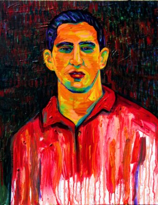
Self-portrait

Tony de Carlo is a native of Los Angeles, California, now residing in New Mexico, between Santa Fe and Albuquerque.
He has been painting every day for the last thirty years. A self-taught artist, he began learning by drawing and painting in journals as a young teenager, each day expressing himself through his visual diaries. Although he abandoned his journals fifteen years ago to work solely on canvas and wood, he continues treating his canvases like pages from his diary, reflecting and expressing his day-to-day life and experiences in his work.
Most of the subjects in his paintings are people he knows personally, and the backgrounds contain elements from his life; his home, his dogs, his city, his neighbourhood park, his gardens and his relationships. He never does any preliminary drawings for his work, but rather makes the attempt to let something flow out from within him.
Some of his work mixes religious iconography with homoerotism. Beautiful portraits and other images blend elements of sensuality, religion, spirituality, and nature with Southern Californian, Mexican and Mexican-American ethnic and artistic sensibilities. Tony's extraordinary talent combines these influences and elements, and a brilliant use of colours to produce his unique vision.
His work is exhibited regularly in museums and galleries throughout the USA, and his paintings are in collections around the world. They have been exhibited at (among others):

Arizona State University (Tempe)
Art Museum of South Texas (Corpus Christi)
California State University Los Angeles
Dezart One Gallery (Palm Springs)
Encantada Gallery of Fine Arts (San Francisco)
Galeria de la Raza (San Francisco)
Jose Galvez Gallery (Tucson)
Liz Blackman Gallery (Hollywood)
Mexican-American Cultural Art Center (Tucson, Arizona)
Mission Cultural Center for Latino Arts (San Francisco)
Palm Springs Desert Museum (California)
Plaza de la Raza (Los Angeles)
The Frye Art Museum (Seattle)
The Mexican Museum (San Francisco)
University of the Arts (Philadelphia)

Sunflowers in a Blue Vase

sexta-feira, 13 de outubro de 2006

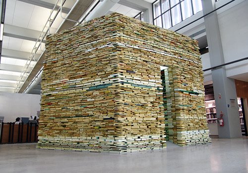
I. «BOOK CELL» - Installation

MATEJ KRÉN

De 19/07 a 31/12/2006
Das 10:00 às 18:00
Hall de entrada
Centro de Arte Moderna J. Azeredo Perdigão

Fundação Calouste Gulbenkian

«O Projecto Book Cell, que será instalado no hall do CAMJAP e aí permanecerá durante seis meses, repete o procedimento recorrente no trabalho deste artista de empilhar milhares de livros, na criação duma estrutura arquitectónica em que somos convidados a entrar.

Book Cell reunirá edições da Fundação Calouste Gulbenkian ao longo dos seus 50 anos, reforçando a natureza site specific do trabalho com a incorporação de um dos mais preciosos filões da história da intervenção cultural desta instituição.

A memória e o saber acumulados nos livros reunidos, fechados e inacessíveis, diversos e preciosos, serão potencialmente recuperados no final, quando todos puderem regressar à sua função de ser lidos, mas terão sido entretanto trabalhados como matéria escultórica e como espírito do lugar em que o artista se propõe reter‑nos: um recinto hexagonal com uma passagem definida por espelhos que asseguram a vertigem da queda, a desmultiplicação ad infinitum, o pânico da desorientação espacial próprios de um infinito virtual.

Designer de formação e projectado publicamente junto do público francês em 1990, na área da arte contemporânea, Matej Krén, nascido em Trencin, na Eslováquia, em 1958, desenvolveu a partir dessa data uma carreira artística internacional ampla e reconhecida. Depois de estudar Belas‑Artes em Bratislava e Praga entre 1977 e 1985, fixou residência em Bratislava até 1997, ano em que se muda para Praga, onde reside actualmente.

Trabalhos seus como Gravity Mixer, Omfalos e Idiom foram já distinguidos com prémios importantes. Refiram-se, por exemplo, nomeações como o Prémio Especial UNESCO 1995 para a Promoção das Artes e o Prémio TatraBanka em 2004, na Eslováquia.»

sábado, 23 de setembro de 2006

Colours of Beauty

Here they are, once again, the magnificent, magic autumn colours…
Enjoy lavishly before winter starts visiting and finally setting in.


Aqui estão elas, mais uma vez, as magníficas cores mágicas do Outono…
Desfrutem soberbamente, antes que o Inverno comece a visitar‑nos e acabe por se instalar.

sexta-feira, 22 de setembro de 2006

I. «Dimas»

Centro Cultural de Belém / Viriato – Teatro Municipal

20, 21, 22, 23 de Setembro (às 21:00) e 24 de Setembro (às 17:00)

Pequeno Auditório

Duração: 90m

Texto e encenação: Graeme Pulleyn
Interpretação: Graeme Pulleyn, Susana Branco e Carlos Bica
Composição e direcção musical: Carlos Bica
Cenografia e figurinos: Helen Ainsworth

«Uma viagem pela mão de Dimas pelo labirinto do nascimento, do amor e da morte: as três pedras mestres das nossas vidas formam os alicerces de uma história que oscila entre a luz da esperança e a escuridão do desespero, entre a alegria da vida e a purificação da morte.
Dimas é a soma de vários encontros entre o teatro, a música e a dança, produto de um processo entre a escrita teatral e a improvisação musical, um espectáculo que envolve, que seduz, que comove o seu público, que o transporta para um outro mundo. Um mundo de emoções puras, de perigos e de prazeres, um mundo de extremos, suspenso entre o real e o fantástico.Três vidas, verdadeiras na sua origem, fictícias no seu desenvolvimento, são a inspiração para este espectáculo, em que Dimas nos guia pelo labirinto da sua mina até às entranhas da terra, onde nasce a fonte da felicidade e da dor. Sem ela não sentimos, sem sentir não existimos.»


[Programa]

Recomendo o espectáculo a quem o queira apreciar.
Eu vi‑o e gostei bastante. Uma prova de que o experimentalismo em teatro não é tudo.
Não tenho quaisquer pretensões a crítico, pelo que são as minhas apreciações que me guiam: uma bela nostalgia da ruralidade, do tempo dos campos, da vida nas aldeias, dos valores rústicos.
Um excelente trabalho.

sábado, 19 de agosto de 2006

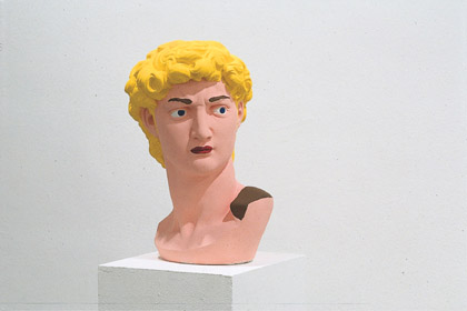
A curious exhibition in Cologne...


Hans-Peter Feldmann

DAVID

Michelangelo Buonarroti

DEUTSCH

Das achte Feld – Geschlechter, Leben und Begehren in der Kunst seit 1960

Museum Ludwig, Köln
Vom 19. August bis zum 12. November 2006

Rückt der Bauer im Schachspiel auf das achte Feld, an den Rand des Spielfelds, vor, so kann ihn der Spieler gegen eine Figur seiner Wahl tauschen. Der Bauer kann sich also in eine Dame verwandeln, die machtlose Figur in eine mächtige, der Mann in eine Frau.

Sexualität erschöpft sich nicht in Familienpolitik und Fernsehserie. Sexualität ist immer auch Beben und Verwandlung, Begehren und Macht, Verführung und Trauer, Glanz und Elend.

Von Variété oder Pornographie abgesehen, lässt sich nur in der Kunst die ganze Faszination des Themas erfahren. Sie lässt nicht nur das gefahrlose Spiel mit den Geschlechtern, mit den verbotenen Wünschen zu, sie allein erfasst ihre Widersprüchlichkeit. Was bedeutet das für das abweichende Begehren? Was bedeutet es nach der Liberalisierung, in einer totnormalisierten Welt? Wie sieht diese Welt für weibliche Männer, männliche Frauen aus?

«Das achte Feld» richtet einen neuen und wachen Blick auf die Kunst, sie tastet die historischen und gesellschaftlichen Entwicklungen ab. Es ist die erste Ausstellung und der erste Katalog, wo Drag und Gender, Queerness und Transsexualität auf breitem Raum, in all ihren Facetten dargestellt werden und vor allem, wo sie erotisch sein dürfen.

Die Ausstellung präsentiert Arbeiten zahlreicher Künstler aus der ganzen Welt.

PORTUGUÊS

A Oitava Casa – Sexos, Vida e Desejo na Arte desde 1960

Museum Ludwig, Colónia
De 19 de Agosto até 12 de Novembro de 2006

Se, no jogo de xadrez, o peão avançar até à oitava casa, no limite do tabuleiro, o jogador pode então trocá‑lo por uma figura da sua escolha. Assim, o peão pode transformar‑se numa rainha, uma figura sem poder torna‑se poderosa, o homem torna‑se mulher.

A sexualidade não se esgota nas políticas familiares ou nas séries televisivas. A sexualidade é, também e sempre, tremor e transformação, desejo e poder, sedução e tristeza, esplendor e miséria.

Exceptuando o espectáculo de vaudeville ou a pornografia, só a arte nos dá a conhecer todo o fascínio do tema. Ela permite não só o inofensivo jogo com os sexos, com os desejos proibidos; só ela abarca a sua própria contraditoriedade. Que significa isto para o desejo divergente? Que significa isto depois da liberalização, num mundo padronizado até à morte? Qual o aspecto deste mundo para homens femininos, para mulheres masculinas?

«A Oitava Casa» lança um olhar novo e desperto sobre a arte, tacteia os desenvolvimentos históricos e sociais. É a primeira exposição e o primeiro catálogo, onde drag e género, queer e transexualidade são expostos em grande escala, em todas as suas facetas e, sobretudo, onde lhes é permitido ser eróticos.

A exposição apresenta trabalhos de numerosos artistas de todo o mundo.

ENGLISH

The Eighth Square – Sexes, Life and Desire in Art since 1960

Museum Ludwig, Cologne
From August 19.th until November 12.th 2006

When a pawn in a chess match reaches the eighth square on the far side of the board, the player can swap him for a piece of his or her choice. So the pawn – a lowly foot soldier – can transform into a queen, a powerless figure into the epitome of power, a man into a woman.

Sexuality does not end in family politics or a TV series. Sexuality is always a quaking and transmuting, is desire and power, seduction and sadness, splendour and misery.

Looking beyond vaudeville or pornography, only art enables the subject to be discovered in all its fascination and specificity. It not only permits a game with the sexes and with forbidden desires that is free of danger, but is alone able to grasp all of sexuality’s inherent contradictions. What does that mean for divergent desires? What does that mean after our present liberalisation, in a world standardised to death? What is this world like for feminine men, for masculine women?

«The Eighth Square» casts a new and sharp eye on art; it sounds out the historical and social developments. This is the first exhibition and the first catalogue in which drag and gender, queerness and transsexuality are presented on a broad platform, in all of its facets, and above all where it is allowed to be erotic.

The exhibition presents works by numerous artists from all over the world.

(www.museenkoeln.de/museum-ludwig)

[An meinen recht lieben Freund Hans Peter!
Es wäre sehr nett von Dir, wenn Du uns Deine Meinung über diese Ausstellung mitteilen könntest. Wir wären alle Dir unendlich dankbar…]

domingo, 30 de julho de 2006

Saturday's Especial Program


Torre de Belém, Lisboa

Yesterday was really a especial day!
First of all I ended up going to bed late as hell, though I knew quite well I had to be ready at around 11:00 a.m. for Saturday's especial program I'd worked out with a friend.

We headed first to the Modern Arts Centre (CAM) of the Calouste Gulbenkian Foundation (FCG), one of the lovliest spots in Lisbon, where you can start by strolling through a marvelous park. That's what we did. High temperature - 30ºC - and not even a light breeze to help us. So we decided to get into the CAM and have an early, summer lunch: nothing cooked and no alcohol; just an «enriched salad» and water, glasses of it... It all tasted divine. Afraid as I was I might fall asleep where I shouldn't at all, I had a large cup of coffee just the way I like it: so black my lips turn brown for a while...

Afternoon's first stop - An exhibition of a few paintings by JOÃO QUEIROZ at CAM.
Large canvas not depicting landscapes, but where you can easily recognize large horizons. Definitely works of a guy who knows perfectly what he's been doing for some decades now.
Yes, I did enjoy it and wouldn't mind at all to bring one of them home with me...

Afternoon's second stop - The exhibition of the day: the Portuguese DOMINGUEZ ALVAREZ of Galician ascend (1906-1942) in the nearby building of FCG. Almost 200 works of a man who died young of tb. Curiously enough (or not) his colours get darker and darker as he approaches the end. Different styles, from naïf small paintings to rigorous, minucious pencil drawings.
As I knew so little of his work, it was a wonderful chance to go through his short career. Moreover, as my friend is a professional of the same area - painter and teacher - I could ask away about what I felt like to. So I felt like a fish in the water...

Afternoon's third stop - Let's go to the movies! Yes, good idea! It's cool inside, the room is almost empty (each and every crazy went to the beach), and we'll watch something worth while in a real movie theatre, not in some crowded mall.
Six short movies by six different directors (among them Spike Lee, Jordan & Ridley Scott, Emir Kosturica, John Woo) under the common title of «All The Invisible Children». If you're not ready to see children suffereing and becoming adults all of the sudden because life says so, then save it for a better opportunity...
Yes, it was important for me to watch it, though I cannot say I've enjoyed it.

By the time we left the movie theatre it was high time to drink something really refreshing before driving back home. We sat nearby the Tower of Belém (yes, there's a picture today, I didn't forget this time) for a while, had our drinks by the river, and then headed home.
I still had something rather boring to do - going to the supermarket... Gosh, how I dislike it!

I'm a bit tired now, but feel quite rewarded. Small things count the most.
I wish you all guys a similar rewarding prize this weekend! Go for it!